Our 19-question validated PARTNER CPRM survey is a powerful tool for capturing relationship data. It can help you understand and strengthen your network, using metrics like trust, value, centrality, and more. But collecting data is only the first step—making sense of it and turning it into actionable insights is where the real value lies.
For those without a background in Social Network Analysis (SNA), this guide breaks down how to interpret your survey results, visualize your network, and apply your findings to make informed decisions that benefit your ecosystem.
Table of Contents
Step 1: Set the Stage for Success
Before diving into your survey results:
- Define Your Goals: Clarify what you want to learn about your network. For example:
- Are you trying to identify key players or resources?
- Are you uncovering gaps in collaboration or trust?
- Are you evaluating progress toward specific network goals?
- Know Your Audience: Tailor your interpretation and visualization to your stakeholders’ needs. For example, a funder might care about impact metrics, while network members might focus on collaboration opportunities.
- Familiarize Yourself with PARTNER CPRM Features: PARTNER CPRM offers more than a dozen built-in tools and features like network maps, data dashboards, and reports that help you analyze survey results. Ensure you know where to find these tools and how they work.
Step 2: Analyze Each Survey Question
While you can create your own custom questions using PARTNER, we highly recommend getting started with our 19-question validated survey to simplify your analysis process. Here’s a walkthrough of key survey questions and how to interpret and apply the data:
1. Organizational Tenure (Q1)
Purpose: Understand turnover and stability among network representatives.
How to Use It:
- Look for patterns in tenure. Shorter tenures may indicate high turnover, requiring onboarding efforts. Longer tenures may indicate institutional knowledge but could also signal stagnation.
Visualization Tip: Group representatives by tenure in a bar chart to assess network stability at a glance.
2. Resource Contributions (Q2 & Q3)
Purpose: Identify what members contribute and what the network considers most valuable.
How to Use It:
- Compare the frequency of each contribution type (e.g., funding, data, volunteers). Are any critical resources missing or underrepresented?
- Use the responses to Q3 to align efforts with members’ perceived strengths.
Visualization Tip:
- Create a pie chart showing the distribution of resource contributions (Q2).
- Highlight gaps with a heatmap that shows mismatches between contributions and needs.
3. Desired and Actual Outcomes (Q4 & Q5)
Purpose: Assess alignment between network goals and members’ priorities.
How to Use It:
- Analyze how many members selected each outcome. Shared priorities suggest alignment, while discrepancies may highlight areas of miscommunication.
- Compare Q4 responses (possible outcomes) with Q5 (most important outcome) to identify if members agree on the top priority.
Visualization Tip: Use a bar chart to show the most frequently selected outcomes. Highlight the most important outcome in a contrasting color.
Action Step: If there’s disagreement about priorities, convene members to discuss and realign on shared goals.
4. Network Success and Drivers (Q6 & Q7)
Purpose: Measure perceptions of success and identify key factors driving collaboration.
How to Use It:
- If scores for success (Q6) are low, dig into the collaboration drivers (Q7) to identify gaps (e.g., lack of shared mission or infrequent meetings).
- Focus improvement efforts on factors rated “Not at all” or “A small amount” by most members.
Visualization Tip:
- Create a radar chart to visualize the scores for collaboration drivers (Q7).
- Add a success trendline to your reports to track improvement over time.
Action Step: Use low-rated factors as a roadmap for interventions, like increasing regular meetings or clarifying shared goals.
5. Relationship Mapping (Q8 & Q9)
Purpose: Understand who connects with whom and how relationships were formed.
How to Use It:
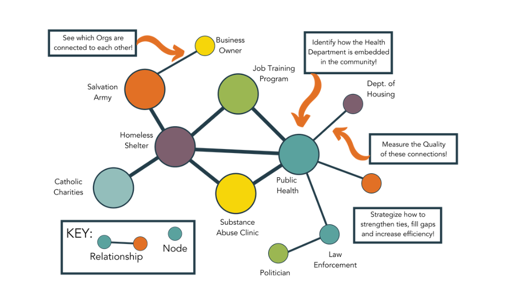
- Use Q8 data to build a network map showing connections between members.
- Use Q9 to identify the origins of relationships (e.g., pre-existing vs. network-driven). If many relationships are pre-existing, focus on fostering new connections.
Visualization Tip:
- Use PARTNER CPRM’s network mapping tool to create a visual representation of connections. Highlight isolated nodes or groups to address gaps.
Action Step: Use the map to inform strategies, such as pairing isolated members with well-connected partners.

6. Relationship Intensity (Q10)
Purpose: Evaluate the depth of collaboration between members.
How to Use It:
- Balance relationship intensities. Too many awareness relationships may indicate a need for deeper collaboration, while too many integrated relationships could lead to burnout.
- Target areas for strengthening ties, like moving from “cooperative” to “coordinated” relationships.
Visualization Tip:
- Color-code your network map by relationship intensity to identify trends.
Action Step: Focus capacity-building on strategic relationships where deeper collaboration would have the greatest impact.
7. Trust and Value (Q13-Q18)
Purpose: Assess perceptions of trust, reliability, alignment, and resource contributions.
How to Use It:
- Highlight organizations with high trust and value scores as key collaborators or potential leaders.
- Address organizations with low scores by identifying the root causes (e.g., unmet commitments or lack of engagement).
Visualization Tip:
- Use a matrix to compare trust and value scores for each member. Highlight outliers.
Action Step: Share aggregated trust/value data with members to build awareness and transparency while maintaining confidentiality.

Get our monthly newsletter with resources for cross-sector collaboration, VNL recommended reading, and upcoming opportunities for engaged in the “network way of working.”
Step 3: Visualize and Share Your Findings
PARTNER CPRM’s visualization tools are critical for making your data accessible and actionable. Here are a few examples of how to use them effectively:
- Network Maps: Highlight key players, isolated nodes, and subgroups.
- Tip: Overlay data like trust or resource contributions on the map for deeper insights.
- Dashboards: Use real-time dashboards to present high-level metrics, such as trust, value, and density, to stakeholders.
- Reports: Generate summary reports and dashboards to share with members and funders.
- Include actionable recommendations based on survey insights.
Step 4: Translate Data into Action
After analyzing your data, the next step is to apply your findings to strengthen your network. Here’s how:
- Identify Key Players: Use metrics like degree centrality and trust scores to identify influencers or critical connectors. Leverage these members for leadership roles or capacity-building efforts.
- Fill Gaps: Address underrepresented resources, missing partners, or weak ties by recruiting new members or building relationships.
- Align Strategies: Use shared priorities (Q5) to focus network activities on achieving the most critical outcomes.
- Monitor Progress: Repeat surveys periodically to track changes in trust, value, connections, or network success over time.
Best Practices for Success
- Simplify Your Analysis: Focus on 1-3 key questions or metrics that directly address your network’s goals.
- Engage Stakeholders: Share preliminary findings with members to validate interpretations and refine strategies.
- Iterate and Improve: Use survey insights to test interventions, such as increasing meeting frequency, then reassess to measure impact.
- Leverage Support: If you’re stuck, reach out to the PARTNER CPRM support team or use training resources to build your SNA skills.
Final Thoughts
With PARTNER CPRM, you don’t need to be an SNA expert to turn survey responses into meaningful insights. By analyzing key metrics, leveraging visualization tools, and taking strategic actions, you can strengthen your network’s impact and achieve your collaborative goals.
For more guidance or support, contact the PARTNER CPRM team at support@visiblenetworklabs.com.


