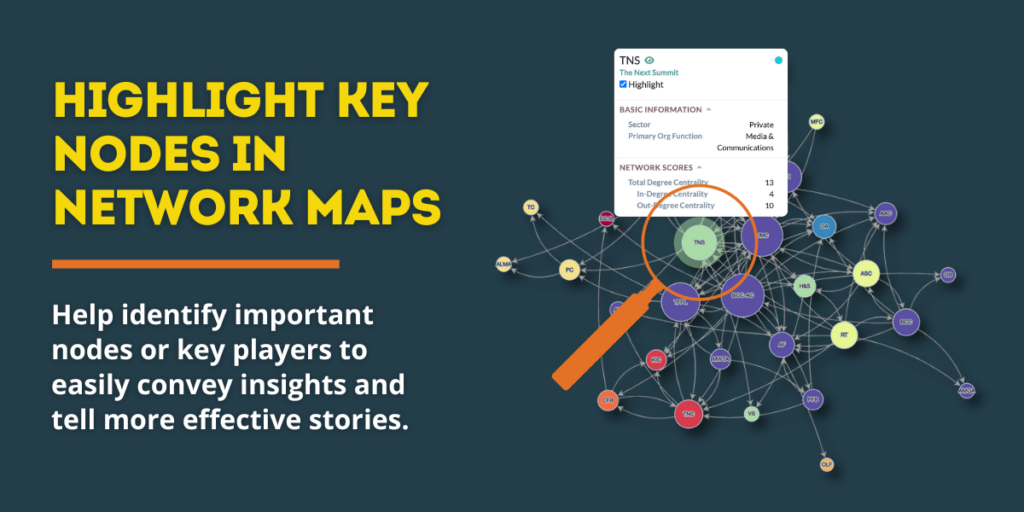
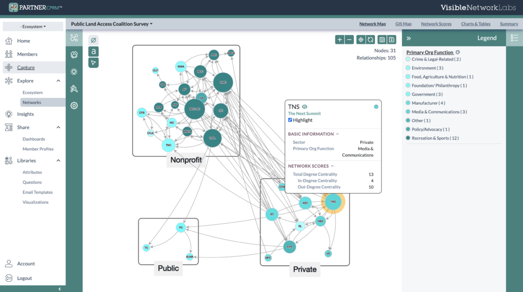
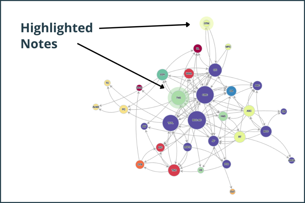
We’re excited to share a powerful new update to the PARTNER CPRM Network Analyzer that gives you greater control and clarity when exploring your network and ecosystem maps. Starting this week, you can now highlight individual nodes to make them stand out—whether you’re exploring your network during analysis, creating visual stories for a dashboard, or exporting maps to share with others.
🔍 How Node Highlighting Works
This new SNA feature is simple to use:
- Click on any node in your network map to bring up its info pop-up.
- Within that pop-up, you’ll see a checkbox labeled “Highlight”.
- Select it to keep that node highlighted—even after closing the pop-up or clicking elsewhere.
- Repeat the process with as many nodes as you want!
Highlighted nodes remain visible when you save your visualization for dashboards or export it as a static image. This gives you a persistent way to draw attention to specific organizations, individuals, or key network players in your visuals.
💡 Making Your Maps Work for You
This feature isn’t just about aesthetics—it’s about strategy. Here are a few smart ways to use it:
- Emphasize Strategic Players: Highlight partners with high centrality, resource contribution, or trust scores. These are your hubs, brokers, or hidden champions.
- Showcase Sector Diversity: Call out members from specific sectors to illustrate how your network spans across government, nonprofits, business, and community orgs.
- Tell a Story: Use highlighting to show before-and-after changes, like which partners increased their collaboration over time or which were added through new outreach efforts.
- Identify Gaps or Opportunities: Highlight organizations that are less connected or less engaged. Use this for planning outreach or convenings.
- Support Your Narrative in Presentations: When presenting to funders, stakeholders, or your internal team, highlighted maps make it easy to visually back up your story.
Have a use case or creative idea for this feature? We’d love to hear how you’re using it—send us a note or tag us on LinkedIn with your map screenshots!
🧠 A Better Way to Visualize Insights
Whether you’re:
- Building a dashboard to share key findings,
- Exporting a static image for a report or slide deck,
- Or just exploring your ecosystem and reflecting on strategy…
This new node highlighting feature helps make your insights easier to see, understand, and act on. Log in or create your own free PARTNER CPRM account and try it for yourself—or reach out to our team for tips on how to get the most from this feature!
Empower Strategic Network Management with PARTNER CPRM
Our platform is designed to help you understand, evaluate, and optimize your community ecosystem using the science of networks. New social network analysis tools and features like this one are part of our ongoing effort to support you in managing relationships more intentionally.
Want to see this feature in action?
Request a demo and learn how PARTNER CPRM can bring your network strategy to life.