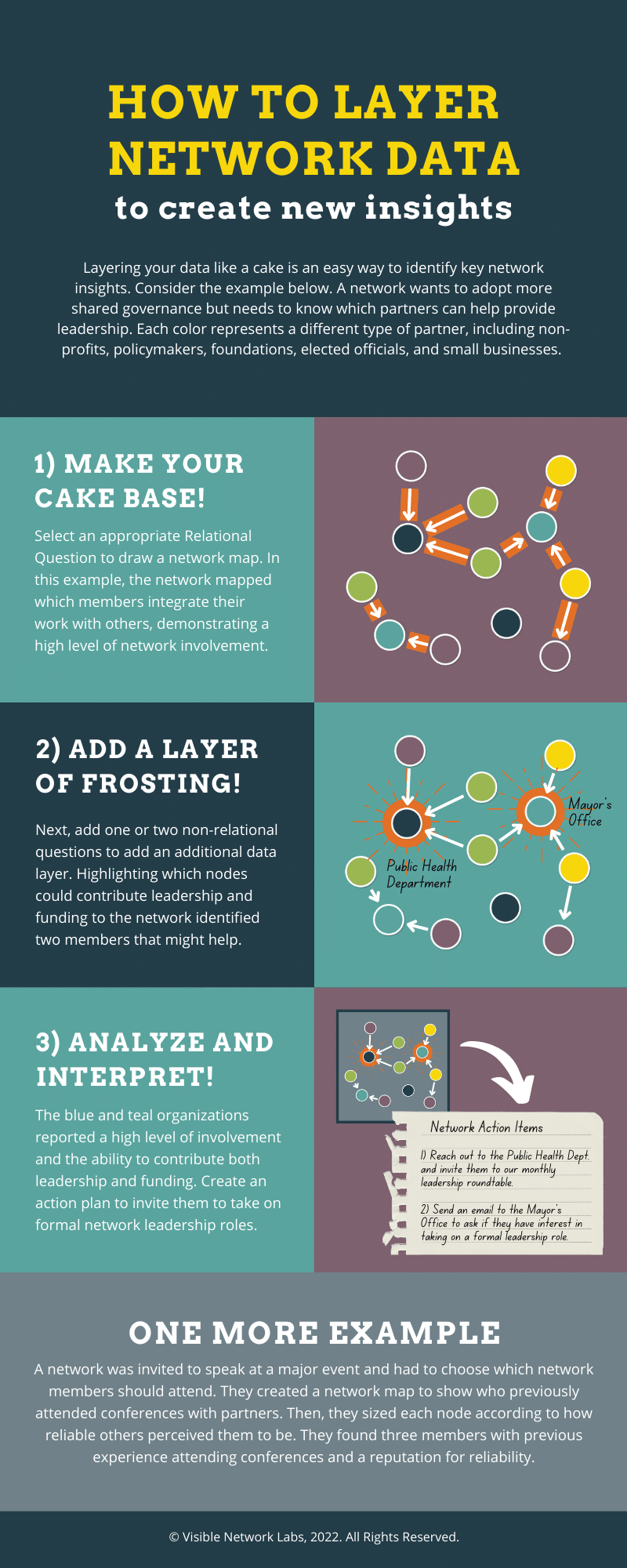
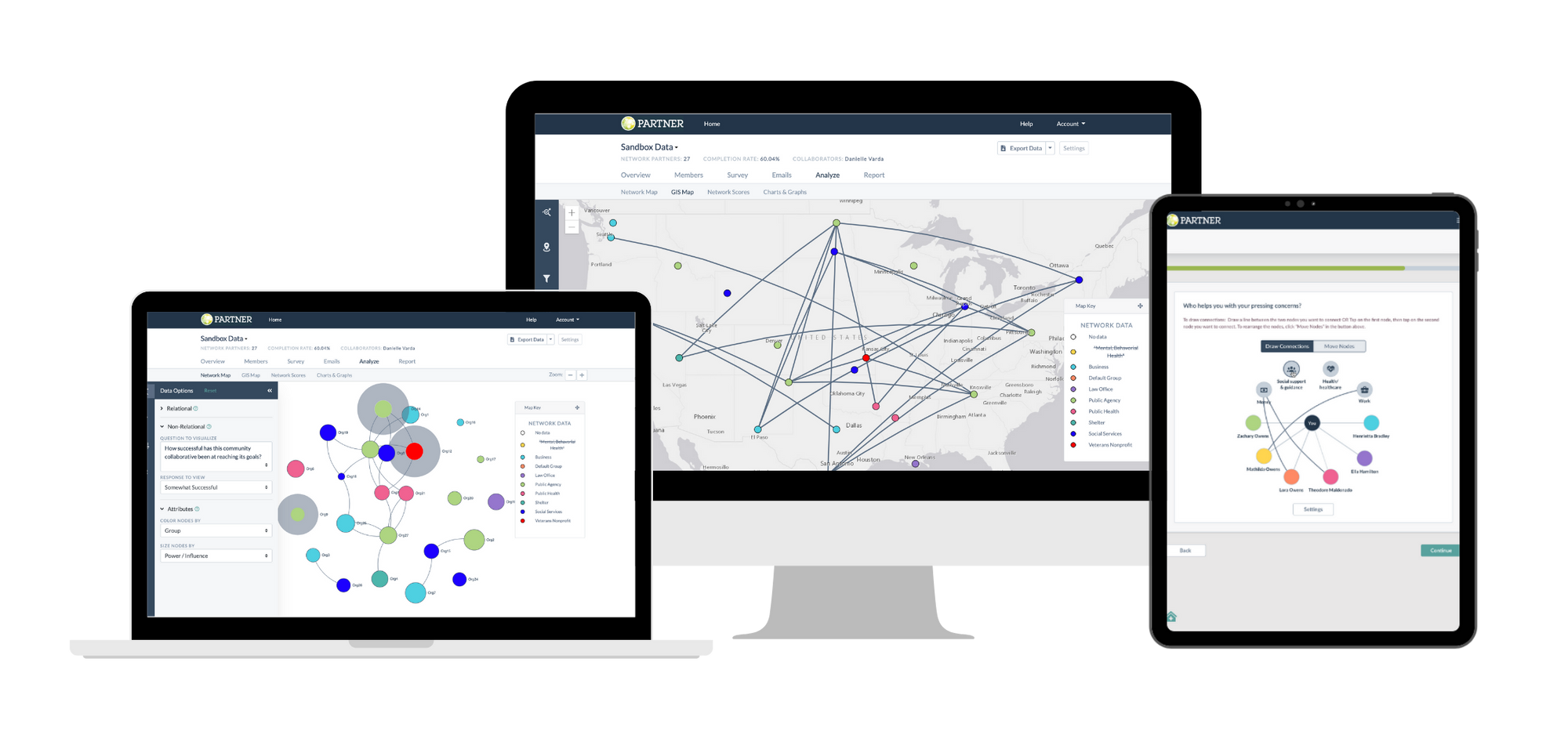
Layering Network Data

Layering Network Data to Create Actionable Insights

Social network analysis is a powerful way to visualize collaboration between partners, demonstrate your collective impact, and create actionable insights to improve the way you work together in the future. While a good deal of attention goes into designing and sharing your survey, the real magic happens once you have your data and can begin mapping and analyzing it.

One of our favorite ways to analyze a network is by layering network data to create new insights. While a basic network map can only visualize one type of data – which is connected to whom – layering it allows you to add more dimensions, like how individual network members are perceived, what resources they have to share, and how they view the network’s level of success. This provides far more insight than a 2D network map.

You can think of the process as similar to layering a cake. You start with the base of your cake – in our case, any network map that visualizes connections. This could be a simple map showing who works together in any form, or it can precisely map one type of connection – like integrated partners or those who work together weekly. Then you can add more data layers, like frosting and sprinkles, to create additional insight.

The network infographic below walks through this process and shares two examples from the field. If you want to engage in this kind of analysis for your network, learn more about using PARTNER CPRM, our community partner relationship management platform, by clicking here.

layering network data

Leave A Comment

Subscribe to our Monthly Newsletter!

Get new articles, updates, and resources related to ecosystem mapping, network science, and cross-sector collaboration.