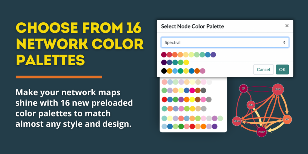
Creating visually compelling network maps with PARTNER CPRM™ just got a lot easier! With our new Color Palette Selector, you can quickly customize the look of your network maps with 16 pre-set color palettes and gradients—all with a single click. Apply these color sets to your network’s nodes and edges (lines) to create beautiful visualizations that align with your organization or network’s brand and style.
Here’s what you need to know about this exciting new PARTNER CPRM™ feature!
What This Feature Does
Instead of manually selecting hex codes one-by-one for each node and edge in your network map, you can now:
🎨 Choose from 16 professionally designed color palettes
🌈 Apply one of 6 gradient color palettes to auto-generate shades of the same color for all your nodes and edges
📌 Easily match your network visualization to branding or accessibility needs
Leveraging Network Color Palettes
Color is key for making network insights clear and actionable. This feature helps you:
✅ Enhance readability – Improve contrast and differentiation between nodes & edges.
✅ Match your brand/style – Apply colors that align with your organization’s look.
✅ Improve accessibility – Ensure maps are colorblind-friendly with high-contrast options.
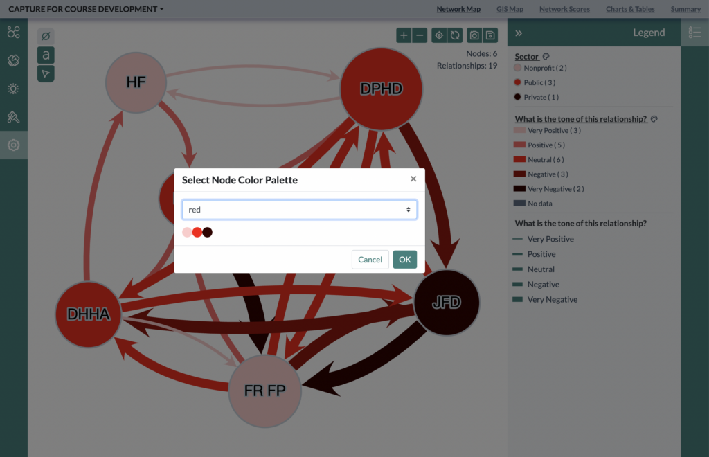
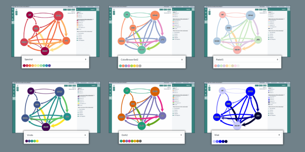
💡Pro Tip: Don’t settle on the first palette you choose that looks passable. Remember, some palettes are ideal for specific use cases. For example, the Dark2 palette is great for maps that will have a white or light-colored background, while the Pastel1 color palette is perfect for dark or black backgrounds.
Here are six more examples of the same network map using different preset color palettes in the analyzer.
How to Use It
1️⃣ Open your network in Network Analyzer.
2️⃣ Choose to color nodes or edges using an attribute or relational data” in the node or edges settings panel.
3️⃣ On the Legend panel on the right, click the ‘color palette’ icon next to the attribute or data point name to open the palette selector.
4️⃣ Click the drop-down menu and select one of the 16 available color palettes.
5️⃣ Click “OK” to instantly apply your selection.
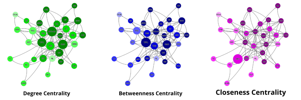
Here’s an example use case for this new feature: A research team mapping public health networks could use distinct color-gradient palettes to color a set of network maps that show the same structure but highlight three different types of network centrality to help differentiate between them. Here’s what it might look like:
Pick Your Favorite Color Palette!
🚀 Try all 16 of the new color palettes today! Log in to PARTNER CPRM™ and start designing network maps with one-click color customization.
Need help or want to ask more questions? Reach out to support@visiblenetworklabs.com.
More Product Updates
Visit our Platform Updates Page to read all our PARTNER CPRM release notes, featured update articles, and other resources and news so you don’t miss a thing.