PARTNER Tool is now PARTNER CPRM!

The Program to Analyze, Record, and Track Networks to Enhance Relationships is even better than before!

Over the past decade, thousands of organizations have used the PARTNER Tool to visualize their network, demonstrate their collective impact, and engage in strategic collaborative management of their community partners. In 2013, we began charging for the use of the PARTNER Tool to ensure its sustainability and implement significant upgrades requested by our users.

Fueled by these investments and our new home at Visible Network Labs, our team made major improvements to make the tool more helpful and valuable for our users. We rebranded the PARTNER Tool as PARTNER CPRM: A cloud-based community partner relationship management system. With new ways to collect data, map networks, identify insights, and share your findings with your partners, it takes the PARTNER Tool of the past to a whole new level. 

Here is an introduction to the new PARTNER CPRM and a history of how we got here over the past 15 years

Evolution of the PARTNER Tool

The original PARTNER Tool, launched in 2008, was based entirely on Microsoft Excel with limited features beyond mapping and simple reporting. Today, PARTNER CPRM is a cloud-based platform with features for collecting, analyzing, mapping, managing, and reporting on your network of community partners. Here’s how we got from there to here.

2008
Introduced
The PARTNER Tool Launches

Dr. Varda launches the new PARTNER Tool based on her network science and public health research.

2013
Expanded
PARTNER Tool Sustainability Plan

After we hit 1,000+ users, we began charging for access to the PARTNER Tool to support maintenance and upgrades based on user feedback and requests.

2017
Expanded
New Home at Visible Network Labs

After a decade at CU Denver, Dr. Varda founded Visible Network Labs, the new home of the PARTNER Tool in order to continue improving and scaling the solution.

2018
Rebranded
PARTNER Tool Renamed PARTNER CPRM

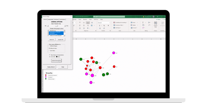
Our development team made major upgrades to transition PARTNER from an excel-based tool to a cloud-based platform for managing community partner relationships, including major new features and functionality.

2020
Expanded
Added GIS Maps, Survey Logic, and Member Attribute Customization

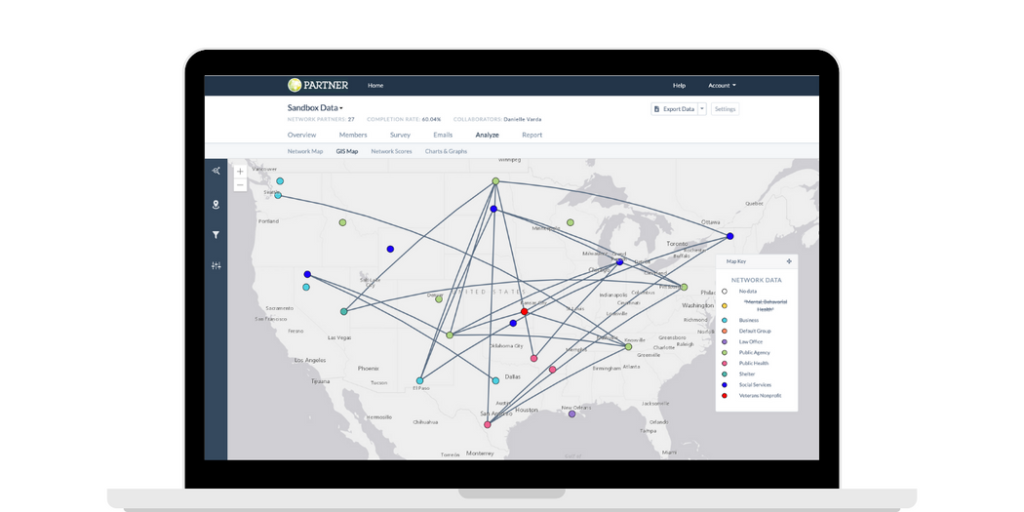
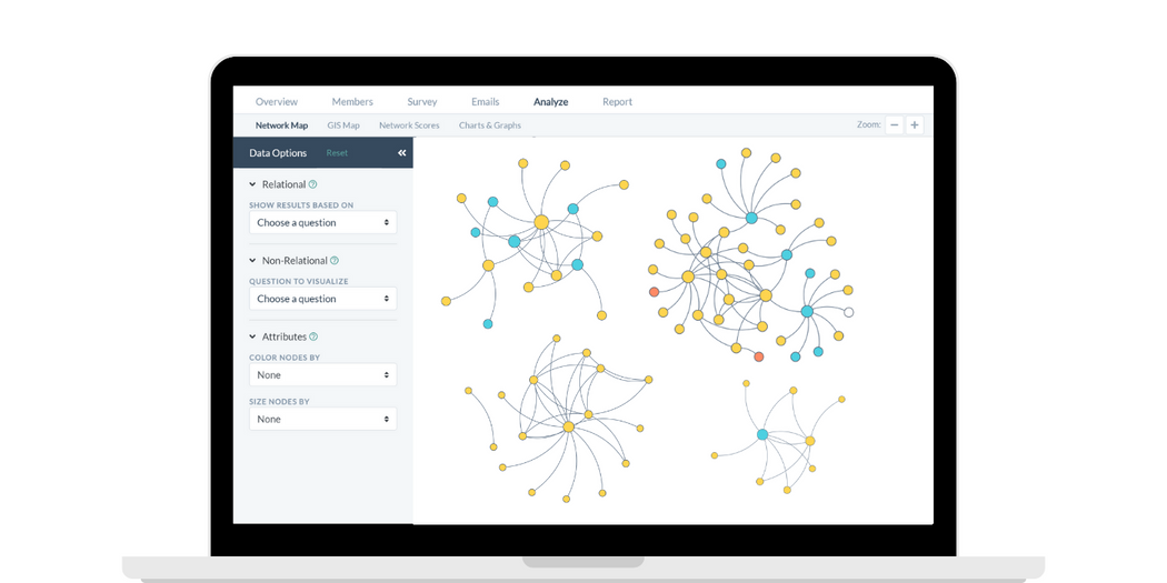
We launched new features requested by our users, including GIS map layers, skip and display logic for survey questions, and the ability to add custom member attributes.

2021
New Features
Introduced Network Member Profiles and New Report Options

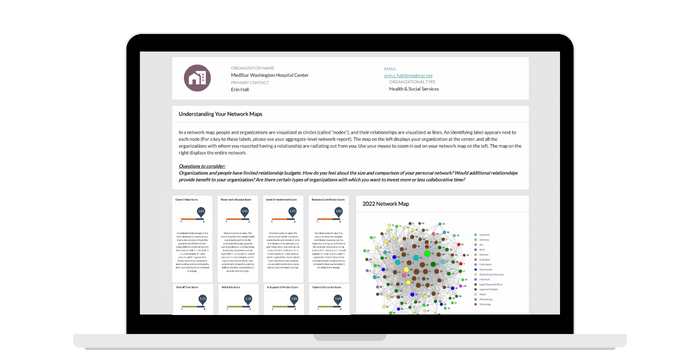
We focused on adding more features to easy dissemination during 2021. New Network Member Profiles make your data accessible for your partners, along with additional reporting options like new Highlight and Subnetwork Reports.

2022
New Features
New Simplified Workflow and User Interface Launched

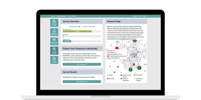
During 2022 we revamped the PARTNER CPRM workflow and interface to make it simpler to navigate and implement in your organization. We also launched new Grab and Go packages for those who want to use PARTNER on their own.

2023
New Features
Coming Soon: Public-facing Data Dashboards and Comparative Analysis

Our development and product teams are working hard on new features to rollout during 2023, including the ability to create and share public-facing data dashboards, and a new analysis option for comparing networks over time.

Our Favorite New Features

We listened to our user feedback and released new features and improvements to serve them better. Over time, PARTNER has gone from being an excel-based mapping tool to a complete platform for ongoing network tracking and management. Here are some of our favorite new features that make this possible.

Democratize your data with your community partners

As your data enters PARTNER CPRM it automatically generates a profile for each of your network members with all of their relevant results. You can share them with partners using a link or save and print a PDF version. Partners can use a Network Member Profile in many ways, including:

  • Identifying key players and influencers in their network
  • Demonstrating their collaboration to funders and stakeholders
  • Strategizing to build and manage partnerships more effectively
  • Finding resources to share and leverage among their partners.

Network Member Profiles are an advanced feature requiring a Premium subscription package.

Design personalized reports to share insights

The Report Builder allows you to save snapshots of network maps from the Network Analyzer to design personalized, professional-looking reports. Add context and questions to consider from our Insights Library to add more depth and guide quality improvement processes.

You can also buy custom-prepared reports from our team of network science experts:

  • Full Reports: 25+ pages of your full survey results
  • Highlights Reports: 2 pages of your most important takeaways
  • Comparative Report: 30+ pages comparing a network over time
  • Subnetwork report: 5+ pages on a specific sub-group within your network

Get the right data by asking the right questions

Skip and display logic in our Survey Builder allow you to hide or show specific questions depending on respondent attributes or responses to previous questions. This ensures that each partner only answers questions relevant to them, saving them time and reducing your workload.

Here are two examples to consider:

  • If you want to ask funders in your network some follow-up questions you can use skip logic to pass over these questions to anyone who does not have the ‘funder’ attribute.
  • Alternatively, you can use display logic to make additional questions appear for anyone who answers yes when asked if they are a funder.

Share interactive network maps with the public

Demonstrate your impact and collaboration and democratize your data by setting up public-facing dashboards with pre-set data parameters. Dashboards display a map you set as the default, are shared using a link, and can be analyzed in the ways that you allow.

This tool is a powerful way to demonstrate the way you are shifting systems and strengthening the community with a wide variety of audiences. Unlike PDF reports, these dashboards are interactive and engaging, and increase the accessibility of your data, all at the same time.

Public-facing Dashboards are in Beta Testing and will be released in the spring/summer of 2023.

Generate place-based insights about your network

Layer your network’s connections over GIS maps of your community or region to analyze your collaboration from a geographic perspective.

You can add additional socio-economic or health data layers to link community outcomes with your collaboration. For example:

  • Identify neighborhoods or towns where you lack connections to target and develop new partnerships.
  • Track changes in health outcomes in the areas with representation in your coalition compared to those without. 

Move quickly with a streamlined interface & workflow

In 2022 our team gave PARTNER CPRM a significant overhaul to streamline and simplify it for our users. The new platform is organized around five simple steps to implement the CPRM in your organization and generate actionable insights.

The five steps are:

  1. Create a survey
  2. Add your respondents
  3. Invite members to participate
  4. Analyze your network
  5. Create reports and share results

Hear From PARTNER CPRM Users:

Learn more: Request a PARTNER CPRM Demo

Want to see the PARTNER CPRM platform for yourself? Reach out to request a web demo. We will demonstrate how it can visualize your networks, measure your impact, and empower you to start practicing strategic collaborative management.

Connect with our Team!

Contact the VNL team to demo PARTNER or discuss a potential research or evaluation project. We can help you learn more about our services, help brainstorm project designs, and provide a custom scope based on your budget and needs. We look forward to connecting! 

Email our team: hello@visiblenetworklabs.com

Send a message: Contact Us Here