
Communities and coalitions rely on strong relationships to create change—but those relationships are often invisible without the right tools to map and measure them. Social network analysis (SNA) can shine a light on these connections, but understanding and acting on the data requires more than just charts and maps. That’s where network storytelling comes in. By translating complex data into compelling narratives, network leaders can build understanding, rally support, and drive meaningful collaboration.
In this blog, we’ll explore why network storytelling is so essential—and share 21 tips to help you do it effectively using social network analysis and a tool like PARTNER CPRM™.
Why Does Network Storytelling Matter?
In today’s interconnected world, telling the story of your network is one of the most powerful tools you have for increasing impact, building trust, and demonstrating value. Here’s why:
1. It translates data into action.
A compelling network story makes your SNA data accessible and actionable, helping audiences understand what the data means and what to do next.
2. It builds shared understanding.
When network members can see their roles and relationships reflected in a larger picture, it promotes a sense of belonging, alignment, and trust.
3. It shows progress and value.
Before-and-after visualizations and clear narratives demonstrate how your network is evolving and the role it plays in creating systems change—an especially powerful message for funders, policymakers, and community stakeholders.

Get our monthly newsletter with resources for cross-sector collaboration, VNL recommended reading, and upcoming opportunities for engaged in the “network way of working.”
21 Tips for Effective Network Storytelling
Here are 21 evidence-informed best practices to turn your SNA data into a compelling and credible story that drives results—whether you’re working in public health, education, philanthropy, workforce development, or conservation.

1. Always Know Your Audience and Goals
Begin every communication effort by clearly defining who your audience is and what you want them to walk away with. Are you informing funders about your impact? Engaging members to increase participation? Helping policymakers see system gaps? The answers will shape your language, framing, and even what network data you choose to highlight. Tailoring your message ensures relevance and resonance.
2. Use an Appropriate Tone and Level of Detail
Adjust your communication style based on the technical comfort and expectations of your audience. For non-expert audiences, use simple language and analogies. For more data-savvy groups, include metrics and methodological details. Above all, keep the story clear, concise, and focused on takeaways.
3. Reveal Your Network Maps Gradually
Avoid overwhelming viewers by dumping a fully detailed map all at once. Start with a simplified view (e.g., major sectors or clusters), then build complexity step by step. This approach makes it easier for people to follow the story and understand how pieces fit together.
4. Use Visual Cues to Emphasize What Matters
Use color, size, labels, and annotations to draw attention to key nodes, connections, or patterns. Highlight new partnerships in a different color. Enlarge nodes representing influential organizations. These cues help guide the audience’s attention and reinforce your message.
5. Filter Out Noise From Network Maps
Remove weak, outdated, or irrelevant ties that clutter the map. Consider displaying only connections above a certain strength threshold. Focusing on meaningful relationships makes the story easier to interpret and more compelling.
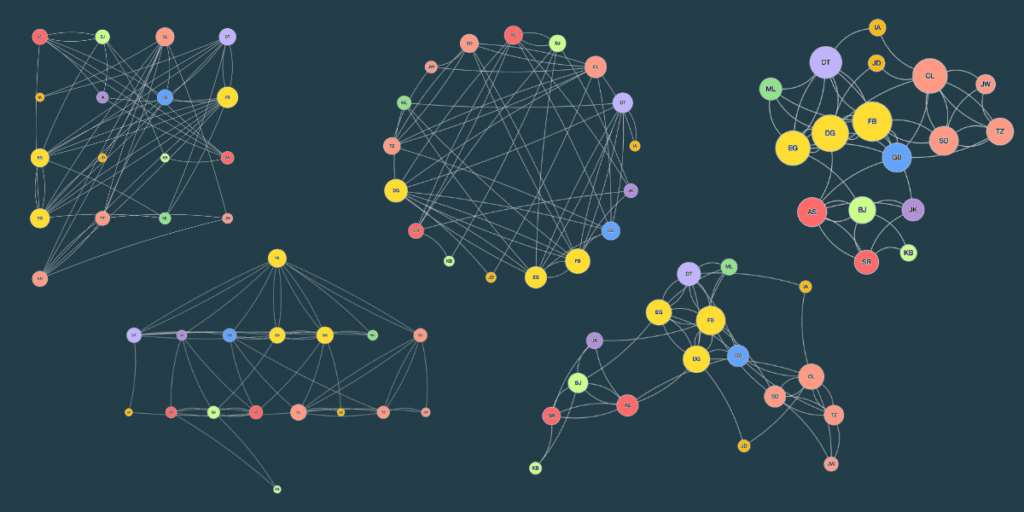
6. Choose the Right Network Layout
Different layouts reveal different insights. Circular layouts are useful for emphasizing group structure. Force-directed layouts show natural clustering. Hierarchical layouts are helpful when showing top-down relationships. Choose the layout that best fits your narrative.
7. Leverage Node Size, Color, and Position
Visual encoding of attributes can bring your network story to life. Use node size to represent centrality or influence. Use color to show sector or affiliation. Place important nodes near the center to reflect prominence. These visual cues can communicate a great deal without extra text.
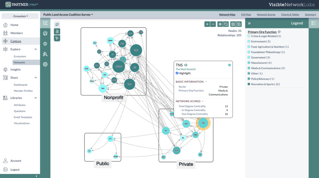
8. Take Advantage of Interactive Features
Interactive maps allow users to click on nodes, filter by criteria, or zoom into sections. This empowers stakeholders to explore the data themselves, encouraging ownership and deeper understanding. Use interactive tools like Kumu or embed maps in a dashboard.
9. Add the Right Supporting Charts
Pair your network visual with bar charts, pie graphs, or timelines to illustrate metrics or trends. For example, show changes in trust scores over time or breakdowns by partner type. These visuals reinforce your narrative and provide additional layers of insight.
10. Always Explain the Relationships
Clarify what each line means—whether it’s a formal partnership, a referral relationship, or information sharing. This helps avoid misinterpretation and ensures your audience understands the context behind the visual connections.
11. Integrate Qualitative Descriptions
Combine numbers and visuals with text-based descriptions, quotes, or case notes. These add human context and meaning, turning raw data into a relatable story. For example, include a quote from a partner about how a new collaboration changed their work.
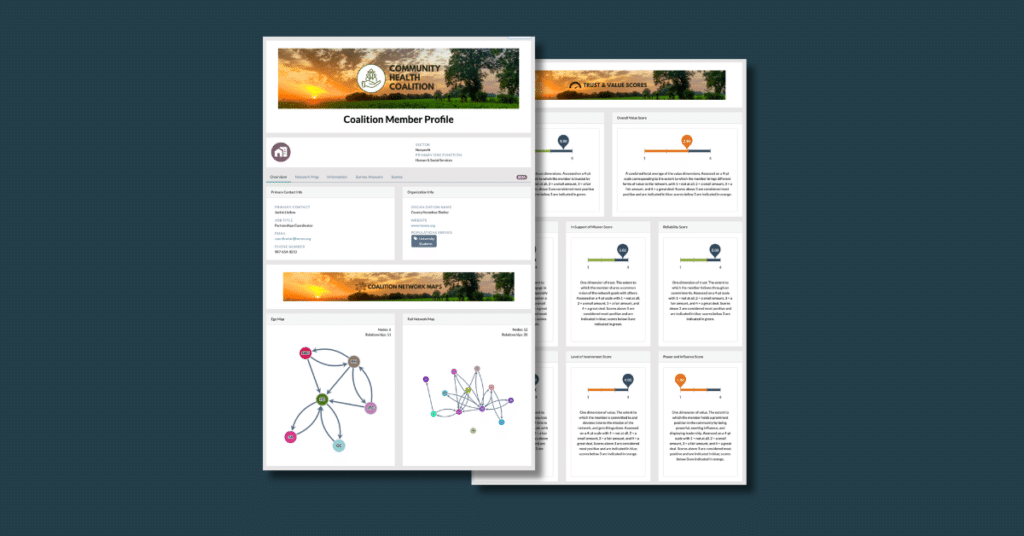
12. Humanize Your Network Maps
Use names, photos, or brief bios to show the people or organizations behind the data. Personalizing the nodes helps audiences connect emotionally with the story and see the network as a living system of relationships.
13. Use Rich Media if Available
Multimedia—like video clips, audio snippets, or images—can significantly enhance engagement. Consider embedding a short video of partners describing their collaboration or showcasing photos from network events. These tools deepen the emotional impact.
14. Use a Classic Narrative Structure
Structure your network story like any good story: start with a challenge, introduce actions taken, and end with results or lessons learned. This arc makes the data more digestible and memorable for your audience.
15. Anonymize or Aggregate Data If Needed
When sharing sensitive information, protect identities by removing or aggregating identifiers. You can present themes or clusters without naming specific organizations, especially when findings might be perceived as negative.
16. Use a Facilitated Approach for Sensitive Data
When discussing difficult findings (e.g., power imbalances or disconnected members), do so in a facilitated setting where stakeholders can discuss and interpret the data together. This fosters reflection and shared accountability rather than defensiveness.
17. Prioritize Accuracy and Transparency
Be honest about what the data shows and what it doesn’t. Acknowledge data limitations or gaps. Transparency builds trust with your audience and adds credibility to your analysis.

18. Invite Interactive Exploration
Encourage your audience to explore the network for themselves. Pose questions like “What do you notice?” or “Where do you see opportunities for stronger ties?” This invites engagement and surfaces new insights.
19. Create Channels for Gathering Feedback
Give stakeholders a chance to contribute their perspective. Collect feedback through surveys, comment cards, or interactive tools. Use this input to validate findings and refine your messaging.
20. Leverage Existing Network Frameworks
Use proven frameworks like the connectivity-health-results model to organize your narrative. These models help structure the story in a way that audiences can easily follow and understand.
21. Think Past the Research Report Format
Don’t limit yourself to dense evaluation reports. Try blogs, social media posts, podcasts, videos, infographics, email newsletters, dashboards, and presentations. Different formats reach different audiences and reinforce your message through repetition.
Tell Your Network Story with PARTNER CPRM™
Telling your network story is easier when your tools are built with storytelling in mind. With PARTNER CPRM, you can:
- Create compelling network maps, GIS map, charts, and tables.
- Filter, size, and color customize visuals by any attribute
- Click nodes to view an info box with more details and scores.
- Design and share custom network member profiles.
- Export graphics and insights for use in reports, meetings, and grant proposals
- Share interactive online dashboards with your stakeholders
Whether you’re a coalition coordinator, program manager, or systems-change leader, PARTNER CPRM gives you everything you need to map your network, measure its impact, and tell a story that moves people.
Final Thoughts
Your network’s data tells a powerful story—but only if you take the time to craft and share it thoughtfully. Start small, try new formats, and remember: data alone doesn’t drive change—stories do.
Additional Resources:
Check out these related resources with more tips and advice for telling effective network stories using SNA.
- Jeff Mohr (Kumu) – Storytelling in Kumu
- LinkedIn Collaborative Article – How to Use Storytelling for Network Analysis Results
- Visible Network Labs — 11 Coalition Communication Tips for Telling Your Network Story
- Cowhitt et al. (2023) – Storytelling with Networks: integrating qualitative data into network diagrams