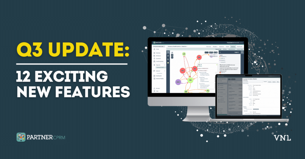
At Visible Network Labs, we constantly look out for opportunities to improve our platform, tools, and services to meet our customer’s evolving needs. The past few weeks have been no exception!
During the past three months, we’ve released nearly a dozen significant improvements to PARTNER CPRM. Here they are and why you should be excited to try them out.
1. View Member Contact Cards
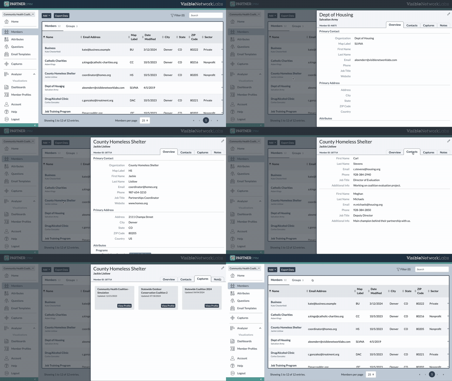
Click on a member’s name in your member library, and a card will slide onto your screen with all your member data. Switch between tabs to view their contact information, attributes, secondary contacts, captures they’re a member of, and any notes associated with their record. This is a quick and easy way to find data quickly.
2. Create and View Member Notes
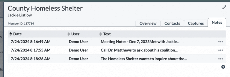
Create and save unlimited notes associated with your network or ecosystem members. These flexible records can be used to track events and meetings, note discussion topics and action items, or simply brainstorm ideas related to that partner for future consideration. View them in your member card where you can also sort them.
3. Save Secondary Contact Information
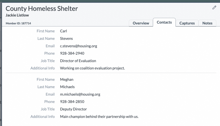
Tracking contact information for multiple contacts from the same member organization is now easy with PARTNER! When creating a member, you have the option to add as many secondary contacts as you wish, including their name, title, email address, and other contact information. Reduce silos and keep contacts more organized.
4. View Profiles for Multiple Captures
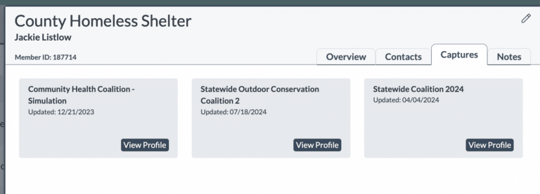
You can now use the capture list in member contact cards to view member profiles with different capture data for the same member. For example, if you want to view a member’s data or network map from a previous year, you can now open it and compare it to your more recently updated profile to identify changes.
5. Assign Attribute Tool
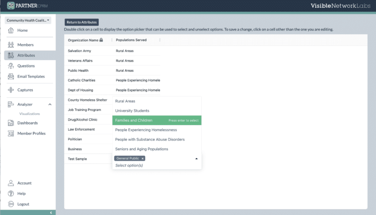
When you want to assign a new attribute to more than one network member, you can now use the Bulk Attribute Assignment feature. Just click “Assign” in the attribute options menu, and you will be able to input data for all network members for that specific attribute. Future updates will expand this functionality to additional parts of the platform – more to come!
6. Member Profile Privacy Controls
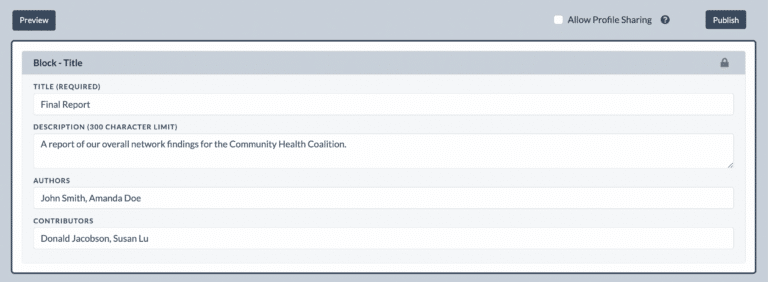
For those making network maps and dashboards accessible to partners, you can now decide whether to allow each partner to view other organizations’ profiles or whether they can only view their own. If turned on, anyone with network map access can click a node to see the member profile for that organization.

Get our monthly newsletter with resources for cross-sector collaboration, VNL recommended reading, and upcoming opportunities for engaged in the “network way of working.”
7. Hide & Display Isolates, Arrows, & Labels
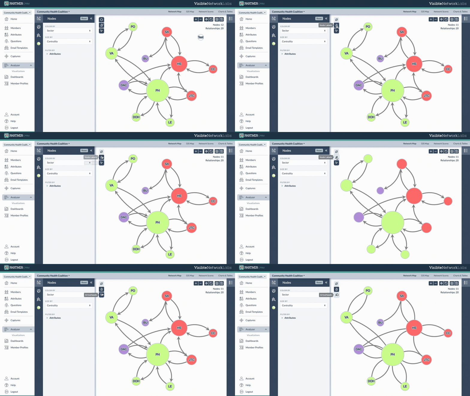
If you want a minimalistic and simpler network map, you can choose to hide isolated nodes, relationship line arrows, and node labels with the click of a button. Look for these new Hide/Display settings in the top left corner of the Network Mapping module in the Analyzer.
8. View Node & Relationship Counts in Legends
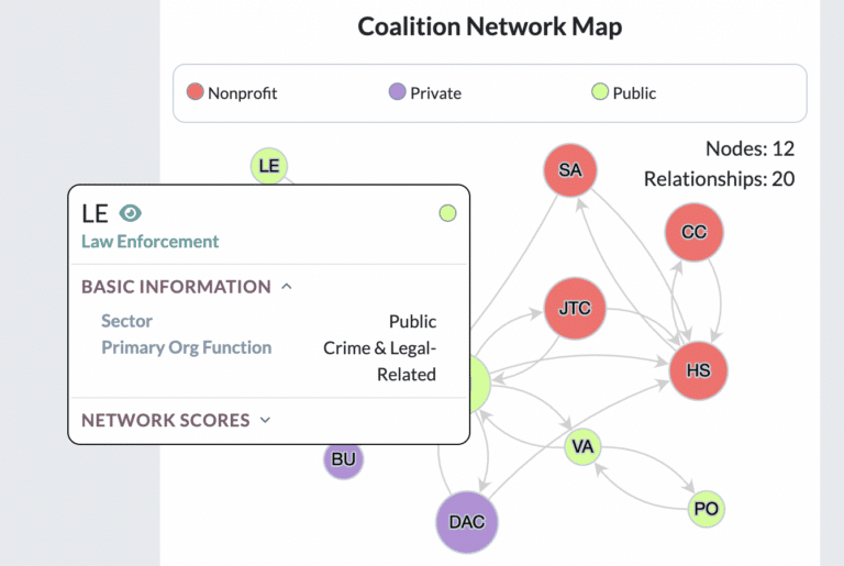
You asked and we answered! Dynamic counts of the number of nodes and reported relationships are now automatically included in your network map legend. This is helpful for showing the size of your network and the degree of connectedness at a glance, which is important contextual information for interpreting your scores and visualizations.
9. Publish Online Data Dashboards
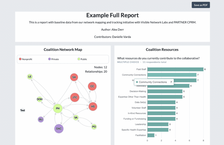
Last but not least, you can now publish customized dashboards online to share network maps, charts, tables, and your other findings with the public. Dashboards are dynamic, meaning they update in real-time as the platform is updated. They are also interactive, allowing visitors to explore maps and click nodes (if you choose to make profiles accessible). Dashboards can also be downloaded to share as static PDF reports.
10. Easier Ecosystem Selection
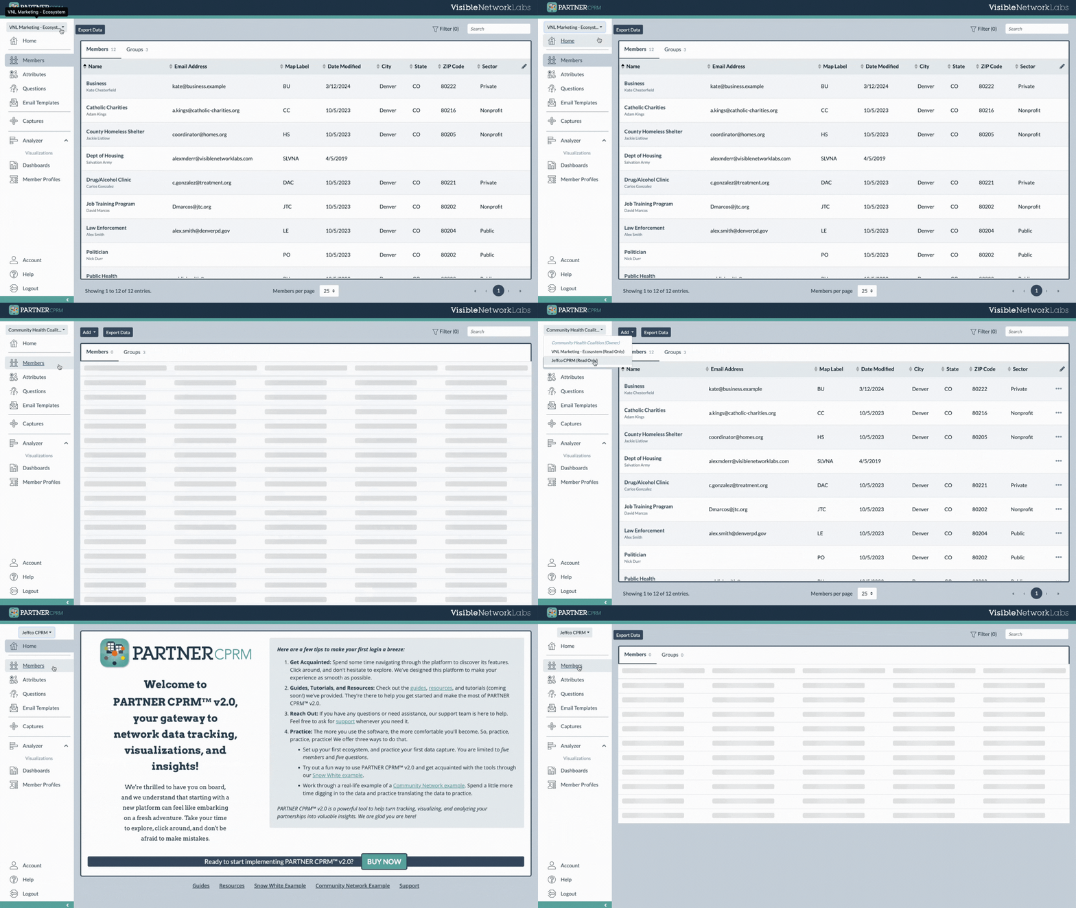
For users with access to more than one ecosystem, it is now much easier to go back and forth. Instead of having to dig into your settings, just look for a new dropdown selector at the top of the navigation menu. Use it to seamlessly switch between ecosystems you have access to.
11. Cleaner Menu Navigation
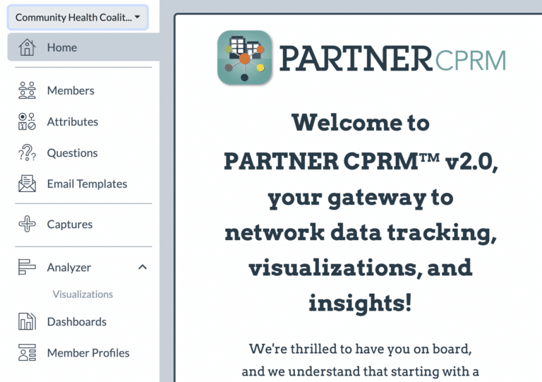
We’ve re-organized the primary ecosystem navigation menu, organizing modules and libraries based on their similar purposes. For example, all four libraries (members, attributes, questions, and email templates) are now located together and separated from other categories by a small divider. This will make navigation more intuitive and ensure the platform is easier to learn to use.
12. Customize Navigation Menus
Last but not least, we’ve given users the ability to customize the appearance of their ecosystem navigation menu. If you aren’t a fan of the order and layout we’ve chosen, you can now select which modules should appear and group them together according to your needs. This can be set for each individual user, for each of their ecosystems.
This feature will be released in the next two weeks. Check back for updates!
See PARTNER Yourself: Request a Demo!

If you need assistance with any of these new features or want to see the platform to try it out yourself, get in touch with our team. We are happy to arrange a time to check-in or demonstrate the PARTNER CPRM platform and these twelve new features. Get started below.
